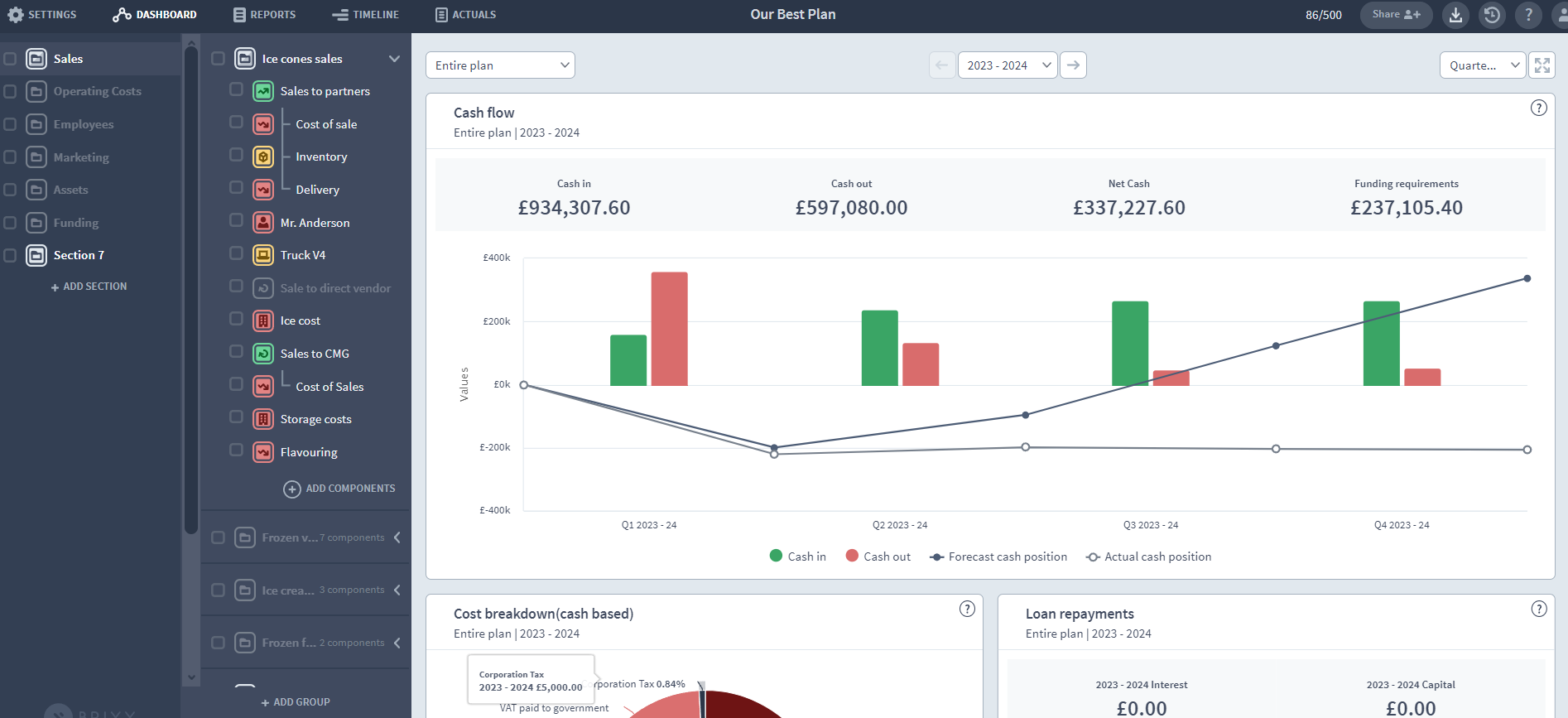

Today I’m going to take a closer look at one of the features of the Brixx Dashboard. We’ve taken to calling this feature ‘Spotlight’. Spotlight lets you filter out what appears on your dashboard, creating custom views of the dashboard which report specifically on different parts your Brixx financial model.
As is often the case in software, the original name for this feature was pretty uninspired – “dashboard section drilldown selector” didn’t stick around for long. It was one of the first major features to be introduced in 2017, along with a revamp of the dashboard charts.
Today I’m going to talk about the Dashboard and specifically spotlight. But sometimes it’s best to see something in action to really understand it. Here’s a video we’ve produced talking about all the things you can do with the Brixx Dashboard.
Old vs new dashboard
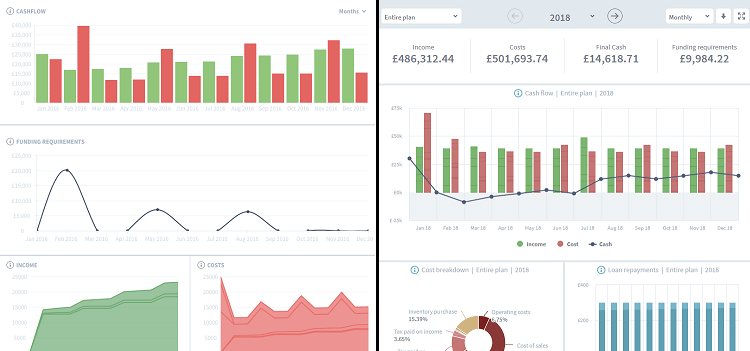
The dashboard we originally launched with was fairly basic. The new dashboard, released in early 2017, updated all charts, added mouseover information to show breakdowns of the figures in each chart, and crucially added Spotlight.

What information do I get from the dashboard?
Headline figures:

What’s important to remember with these headline figures is not just how spotlight is set, but which year of the dashboard is set to display. In a multi-year plan, you can choose which year the dashboard displays information for, or select the every year of the plan to be displayed. Final cash, for example, will display the final cash position of the plan in the timeframe set – be that the first year of the plan, the second year of the plan, or the entire plan duration.
Charts:
1. Cash Flow
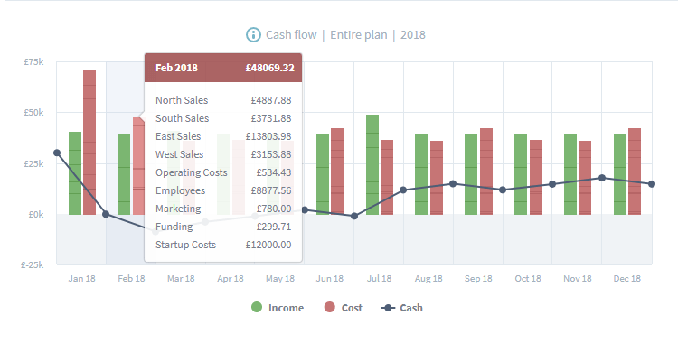
The cash flow chart shows the cash coming into the business and the cash leaving the business. This includes any VAT payments, cash coming in from loans, shareholders and interest. The cash flow chart display bars for income and costs, which are broken down by the plan’s sections, groups or components depending on how spotlight is set. In addition, a cash line is overlaid on the bars, showing the business’s cash position, including any starting cash, at any given time.
2. Cost Breakdown

This pie chart shows what % each cost type takes up for the period in question, usually a single year of the plan. This displays all cash going out of the plan, including VAT paid to HMRC and VAT paid on goods and services. It also displays Operational costs, Costs of sale, Inventory costs, Asset purchases, Investments, Dividends, Capital repayments and Interest payments.
3. Loan repayments
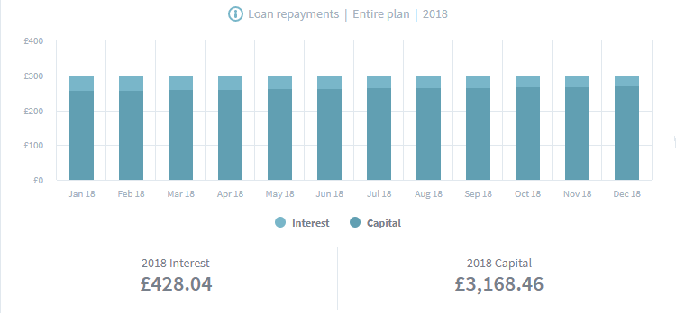
A simple chart that tracks the capital and interest payments made on loans during the selected year/s. The numbers below show you how much total interest and total capital are paid in the period.
4. Asset value

This chart breaks down the asset side of the balance sheet, displaying the asset items in the business plan which have value. These include Surplus Cash, Assets, Inventory, Investments and Cash owed to the business (accounts receivable). Below the chart is the total asset value contained in the business at the end of the year/s selected at the top of the dashboard.
5. Break-even
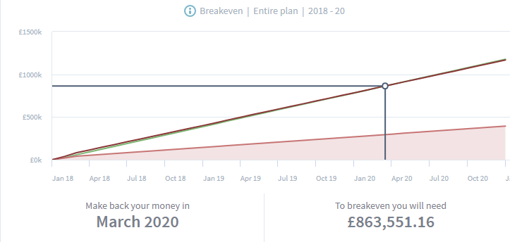
The Brixx break-even chart is a little different to break-even charts you may have seen elsewhere. Instead of tracking units, our break-even chart is a simple cumulative money vs time chart, showing income (green line), direct costs (red line) and operating costs (red shaded area). When the plan’s cumulative income rises above its cumulative costs, it is considered to have broken-even from an operational perspective. Unlike all of the other charts, the break-even chart always displays all years of the plan – as the break-even point could occur in any of them. It does, however, adjust with spotlight – so you can see a break-even chart for individual sections and groups in the plan.
Why spotlight works in Brixx
Brixx plans are built from modular building blocks called sections, groups and components. Sections and groups are a bit like folders on a computer. They exist to organise and structure your plan. Components are like files. They sit inside groups and perform calculations for the specific financial activities they represent (like taking out a loan and repaying it, or buying an asset and depreciating it).
Spotlight lets you choose which part of the plan appears on the dashboard. You can select:
1. The entire plan
The dashboard shows figures from the whole plan. On the Cash Flow chart you can mouse over columns of income and costs to see them broken down by section. At this level you can see which sections are contributing the most income and costs, and get a full picture view of the business through each chart.
2. A specific section
If you select a specific section to view the dashboard will only show figures from the selected section. Mousing over the Cash Flow bars will show you a breakdown of income/cost figures coming from the groups in that section. Focussing on just one section of the plan lets you isolate the financial activities in that section, and see a further breakdown of the income and costs it generates.
3. A specific group
This is the deepest level of granularity. The dashboard shows figures from a single group in the plan, and the mouseovers on the Cash Flow chart will display the figures from individual components in the plan. This helps you track what you’re seeing in the dashboard charts to their sources in Brixx components.
Business plan tips for making great use of the dashboard
So how can you take advantage of spotlight in your Brixx plan?
1. Compare and contrast
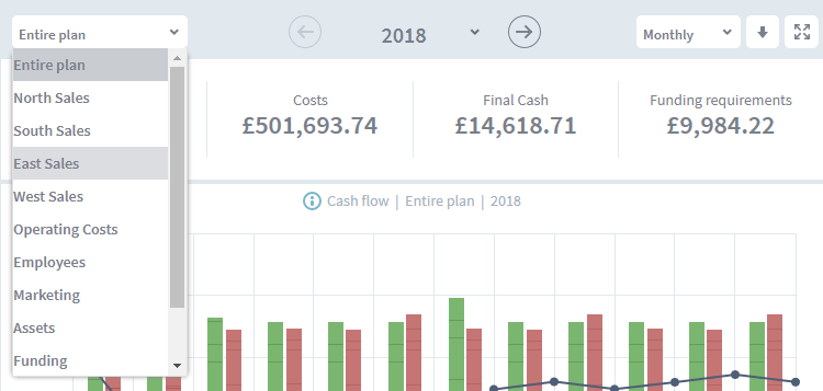
There are two ways you can use the dashboard to compare and contrast – comparing different parts of the plan, or comparing the same parts of the plan in different years. To make this effective, ensure that your sections or groups contain items that you will want to compare. For example, you might have several shops, with a section for each shop with its associated costs and revenue. Or a group for each line of products or services you sell, and their associated costs. Remember that groups can include any components – there’s nothing to stop you putting a loan in the same group as an asset or a source of income – everything ends up on the right report accounts. Sections and groups are means of giving your own structure to the plan, to answer questions and show comparisons unique to your business.
To compare any two charts, all charts can be downloaded as a .png or .pdf. In the future we’ll introduce a comparison dashboard to handle this in the interface.
2. Visualise the impact of connected activities
In a large business plan it can often be hard to understand the impact of a particular product, service, project or financial arrangement. But ensuring that everything to do with these is included in a single section or group, you can use spotlight to get a picture of that particular subset of the business’s activities, without the rest of the business’s activities blocking the view.
To take a familiar example (familiar in my case as a tenant I hasten to add!), if you are a landlord lets say you purchase properties through a mortgage, improve them and rent them out, but also have costs associated with maintaining the property and legal costs which pertain to that single property. You could create a group for each property, including the loan required to buy the property, the asset representing the property itself, further assets for its furnishings and inventory, costs for advertising the property, maintenance, bills and legal work, and rental income for letting the property out. Having all of the components in one group and selecting that group with spotlight would enable you to see the figures for just that property, without having any of the business’s other concerns clouding the picture. If our fictitious landlord has several properties, they could use spotlight to show the section containing all such properties, with clear mouseovers on the cash flow chart to see the difference in income and costs for each property.
What about reports?
Brixx reports work in a similar way, letting you drill down into the sections, groups and components of any report line on the cash flow, profit and loss and balance sheet. Currently we don’t have a spotlight feature there to just display a report of a particular section or group* – but it’s at the top of the list for future report features!
*(psst: though in the meantime you can achieve this by turning off all of the sections and groups in the plan, other than the one you wish to report on. Just don’t forget to turn them back on again!).

