
Welcome back to our monthly update.
Exciting news this month – the long-awaited Xero Integration Beta is now live!
We want to say a big thank you to the initial testing group who are now using the product and providing feedback. Your comments have been invaluable in helping us improve the user experience, and ironing out some of the kinks.
If you haven’t got involved with the Beta yet and would like to, please drop us a line using the contact channels at the bottom of this article.
We’ll be opening up the Beta to more users in the coming weeks. Although these numbers will still be limited, get in touch now to secure your place!
Please see all of our Xero Beta guides.
Xero next steps
We have released an “Other Liabilities” field in the Opening Balance – check it out on the opening balance screen in “Settings”.
We’re also working on the following:
- Opening VAT field – this will allow you to set your opening VAT position and forecast the future government payment in your plan based on this opening value and your tax settings
- Support for handling a high volume of Xero cash transactions
- Automatic data refresh every 24 hours
- New manual input for inventory stock sold
- New ‘purchase more asset’ capability in the asset component
As soon as these are live, we’ll let you know.
New chart prototypes
What would an “Insider” be without inside information? Today we’re pleased to share with you some sneak peeks of new Brixx dashboard designs that the team have been working on.
Our current dashboard is very focused on two themes:
- Cash flow data
- Forecast data
This only really scratches the surface of outputs that we could visualise. Since the dashboard was first implemented, we’ve introduced manual actuals and now we’re introducing Xero actuals too.
It’s time our dashboard reflected that.
In addition to actuals vs forecast, there are a vast array of charts we want to implement around profitability, KPIs and many other important metrics for you to forecast and track.
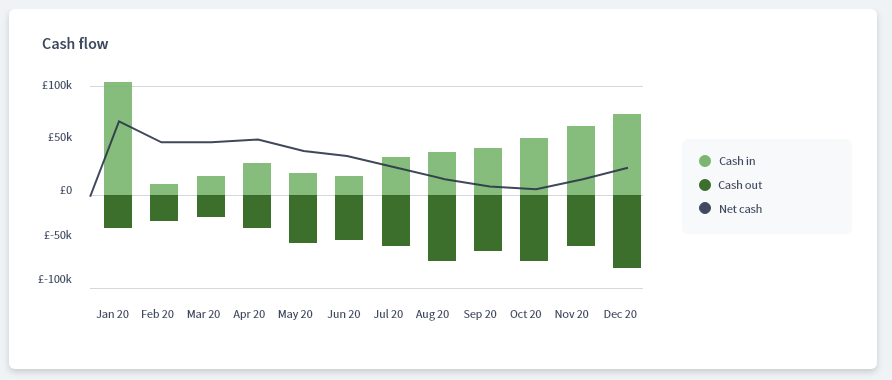
Below is a preview of our evolving designs. It shows charts for cash flow, profit & loss and balance sheet. The key addition is the new ability to turn on actual performance. This mode turns your forecast into a ghosted chart in the background with new actuals overlaid on the top.

Please keep in mind these are in an early stage of development and we are evolving the design at quite a pace.
The actual data will be fed directly from Xero or manually entered into Brixx just like in our actuals vs forecast reports.
Our current thinking is to evolve our single dashboard into multiple dashboards on tabs. You’d have a financial summary followed by dashboards focused around cash, profit and your balance sheet. Each dashboard could hold a myriad of different charts and metrics focused around their specific theme.
The goal is for all of these charts to support ‘actual performance’ mode where you can compare your performance with your forecast at a click of a button.
New cash flow forecast chart:

Cash flow chart with 3 months of actuals:
Tell us what you want from your Brixx dashboard
This is just a small subset of charts we are working on!
If there are aspects of our current dashboard you love or you hate, or there are specific charts you’d really like to see, please let us know. Your feedback is invaluable.
Blog post spotlight
Are you signed up to our blog? Receive blog posts on finance, cash flow and business topics straight to your inbox each week!
Over 3,000 people are signed up already.
This month we want to shine a spotlight on an article written by Product Manager, James Beer.
This article tackles the common myths surrounding cash flow – with actionable tips to help you avoid these confusions and improve your business planning!
Socials
We have Facebook and Linked In Groups, and a Twitter feed. Come and get to know us a bit better and get involved in the discussions!
That’s all for this month, remember you can contact us on any of the channels below! We love to hear what you think.

Stay safe,
The Brixx Team


